Monday, December 18, 2017

Tween Girl's Bedroom

It's been a few years since we've updated my sweet baby girl's bedroom and in the meantime she's transformed into a young lady. In many ways it seems to have happened in the blink of an eye. When it comes to your children, time passes a little too quickly and like that they're all grown up.

Ok...perhaps I'm being overly dramatic. My eldest is only in her tweens and now wants a more mature, yet feminine, bedroom. Her only request was that I incorporate lavender--her favorite color of the moment. With little else to go on, I eagerly began my quest to create a room that personifies my daughter. Piece of cake, right?!?

I scoured the web for furniture, bed linens, window treatments, and lighting--everything a young lady needs to live comfortably. Here's what I came up with.


Like most of my design plans, it all started with the rug. This exquisite rug by Safavieh was a perfect match. The tone on tone grey conveys an air of sophistication, while the flowers and hint of lavender offer a touch of whimsy. And with that, I now had a color scheme.


The other request my daughter had was for bunk beds. What kid doesn't like bunk beds?!? I found a sleek, modern one that matched perfectly. Overall, the reviews seem good and I'm optimistic it will live up to my expectations. My daughter will sleep on the top bunk. The bottom will be her reading nook and serve as an extra bed for when she has sleepovers. A dramatic canopy will envelop the bunk bed, offering my daughter her own little oasis where she can curl up with a book or simply day dream about her life for a spell.

Once the two main focal points of the room were chosen, I turned my attention to bed linens and pillows--items that would soften the room. I needed to find something that was feminine, but not too girls. I adhered to the color pallet of lavender, dark grey, light grey and white, but found it came across a bit flat so I added a pop of mint. In the end, what I came up with was a mature and sophisticated look for a young lady on the verge of becoming a woman. {Sigh...This is a bittersweet moment that moms of older girls can totally relate to and sympathize with.}

Another major function of the room will be studying/homework. We are blessed to have two closets in my daughter's room. While {I have no doubt} there will come a time when she'll be begging for that space to store a plethora of clothes, for now the one closet offers ample storage. The second will be transformed into a work station. I will share my plans for that space in an upcoming post, but I've provided a few hints that I hope peek your interest.

1 / 2 / 3 / 4 / 5 / 6 / 7 / 8 / 9 / 10 / 11 / 12 / 13 / 14

Above I've provided links to the items I've sourced for this project. And since you can't truly ascertain the quality and color from a picture, I wait with bated breath for everything to arrive in the mail. Fingers crossed everything coordinates as expected. Regardless, it's my sincere hope that I succeed in creating a room that's uniquely my daughter. I'd love to hear your thoughts. Please leave feedback below.

Friday, December 19, 2014

Elf on a Shelf

Christmas is such a magical time of year, especially if you have young children. Their eyes are full of wonder and they believe without question in the magic of Christmas. The advent of the Elf on a Shelf enables parents to prolong that wonderment by offering boundless opportunities to create a little magic.

Here is something I recently did for my littles that was a great success. I stole borrowed this idea from pinterest, but gave it my own spin. The blue party streamer represents ice and the red a spider web. I think it would have been better in white, but I used what I had.


Friday, September 12, 2014

My Organized Pantry


In my quest to simplify life, I recently set out to organize my home. There isn't an area that won't {eventually} get touched. And while taking on this colossal task is anything but simple, I can feel my stress level dissipate with every project I complete.

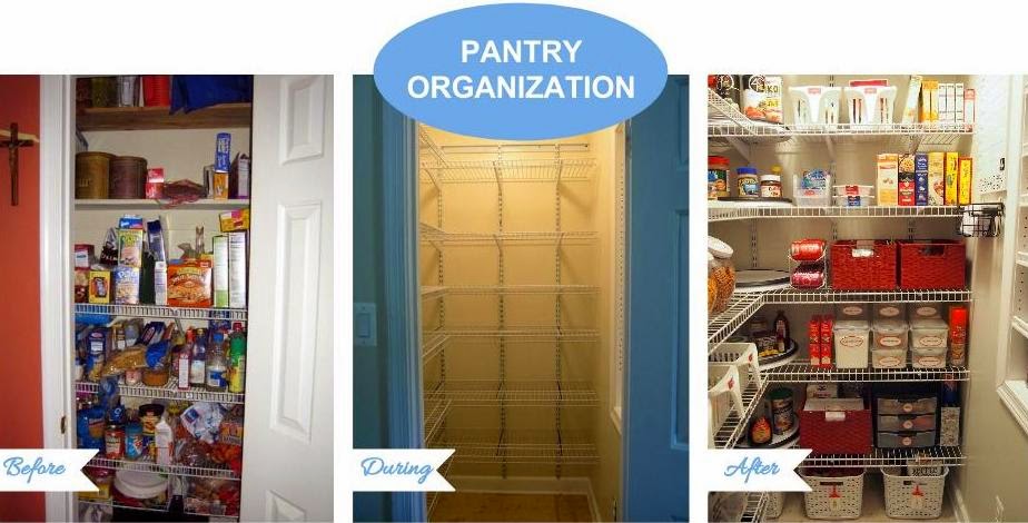
Our pantry was a prime example of wasted space. My husband and I discovered an extra three feet behind the back wall and set out on a mission to expand the space into a glorious walk-in pantry. Here's a look at what we started with.


After much toil the expansion is complete and I turned my focus on maximizing the square footage. I started by clearing out the pantry, which gave me a clean slate. I went through all the food, categorizing and clearing out expired items. Then I analyzed the space, coming up with a comprehensive list of my needs, to ensure the organizational tools I implemented would increase the functionality. Organizing products aren't cheap and the cost can quickly add up. I wanted to avoid expensive missteps. The end result was a truly custom solution using mostly off-the-shelf {lol} organization tools. Let me give you the grand tour.


I maximized storage by taking full advantage of the vertical space and bringing the shelving all the way up to the ceiling. A step stool makes it easy to access items on the upper shelves. We chose wire shelving by ClosetMaid because the shelves can be adjusted to suit our changing needs.

On the top shelf I placed several Lazy Susans. I love using Lazy Susans on upper shelves because it allows me to effectively utilize the difficult to reach space towards the back of the shelf. No more fumbling for items stuck in the back, tipping things over in the process or knocking them to the floor. I contemplated putting infrequently used items in baskets, but I find it awkward to pull down sometimes-heavy baskets from that height. I can now access the entire shelf with one spin of the turn table. And these Lazy Susans by Oxo are especially nice because the deep ledge helps keep items from flying off. Three 11-inch Lazy Susans that hold my oils, vinegars, and cooking wines, and two 16-inch Lazy Susans hold our collection of adult beverages. I also keep extra paper towel rolls up here.


On the second shelf I have my pastas and rice in air-tight containers, as well as boxed side dishes. Two large storage bins with handles hold bagged side dishes and soups.


On every shelf I utilize a large Lazy Susan in the corner so I can easily access every item including those stored in the back that would normally by "lost" in the deep corner. This one holds my pasta sauce, bread crumbs, and salad accoutrements.


On the third shelf I keep two small storage bins with handles for packaged gravies, sauces and marinades. A three-tiered, non-skid shelf organizer allows me to easily see my canned goods. A storage bin from an office supply store houses packets of tuna. This shelf is where I also keep the boxed meals. The Lazy Susan holds peanut products and honey.


The next shelf holds large cookie jars filled with various cookies, snack crackers and pretzels. The clear containers enable me to see exactly how much I have left of these often-used items so I know when to buy more. A repurposed coffee container holds straws and cans of soda are on a rack nearby. I opted for open baskets to corral random snacks that we don't have much of. I got these baskets {which came in various shades of pastel} on steep after-Easter clearance from Michaels. I spray painted them red for a uniform look.


On the next shelf I used more small, storage bins with handles to hold fruit snacks and packaged crackers and cookies. Like all our snacks, these are stored low so the kids can access them. They love how easy it is to get to and are so proud to get food for themselves without my help. While I recognize this set-up wouldn't work for every family, I'm fortunate to have kids that don't abuse the privilege. They always ask before grabbing a snack. Additionally, having them easily accessible in open containers makes packing school lunches a breeze.


Also on this shelf are all my baking items, such as flour and sugar, in air-tight containers. Baked goods can attract bugs if not stored properly and these Lock & Lock containers really do the trick. The uniform sizes and square profile make them easy to stack and keep organized.


The bottom shelf is mostly dedicated to breakfast items. I have four tall, narrow containers to store cereal. Whimsically, I enhanced the containers with giant vinyl letters identifying the contents, as well as chalkboard labels to specify what kind of cereal is within. Stackable storage bins from an office supply store hold individual outmeal packets and bags of pop tarts. I converted a spagetti container to store cupcake liners. 


Also on this shelf is a large woven basket, spray painted red, holds breakfast bars and muffin mixes. The Lazy Susan in the corner has syrup and a container of oatmeal. A three-drawer plastic organizer is used to store baking chocolate, cake decorating tools and sprinkles. Finally a simple magazine holder was put to great use storing my plastic wrap, wax paper and aluminum foil.


Large plastic storage bins corral like items {like chips, crackers and totes} and keep everything off the floor.


I wanted to utilize every square inch of space, so my husband and I built a custom spice rack between two wall studs. The shallow shelves keep everything front and center and the hitching post-style toe rails keep items in place. I added shelf-liner to the back to make it "pretty". It's my favorite part of the pantry. Isn't it beautiful!?!


I took advantage of the unused wall space by hanging a magnetic whiteboard for weekly meal planning. Below it is a shower organizer that I converted to a note station. The large "basket", meant for shampoo/conditioner, was the perfect size for 4x6 index cards. These are ideal for jotting down notes and grocery lists. The smaller "basket", meant for soap, has a marker and eraser. The two hooks, meant for towels, are where I will hang the aprons.


And if that wasn't enough, I installed a magnetic strip to place bag clips and spice tins, which I used to hold elastic bands and box tops.


Finally, I finished the space by adding labels to practically everything even though it wasn't always necessarily. It helps make the pantry look even more organized and pretty. I used a combination of custom-made labels, repositionable labels, chalkboard labels, tags, and bookplates.

I increased the cuteness factor by placing vintage food advertisements in simple frames {spray painted red to match the rest of the room} and adding them to the unusable wall space above the spice rack.


It took a lot of hard work and late nights by both my husband and I, but I have the most amazing pantry. It's one of those spaces I find it difficult to believe is actually mine, even when I'm standing right in front of it. Now for the rest of the house. {sigh}

Here's a side-by-side look of the before, during, and after.


Tuesday, September 2, 2014

Organized Kid's Kitchen Drawer

Now that the littles are back in school, I've been going crazy organizing the house. One project I'm super excited to share is the kids' kitchen drawer.


I like to store the kids' dishes down low so they can reach them. They're proud to get their own water without mommy's help and even help me by setting their own place at the table. Best of all, they're learning how to unload the dishwasher by putting their own dishes neatly away in the drawer conveniently located next to it.

While I've always kept things tidy, the absence of any dividers made organizing the large drawer a daily task. The constant opening and closing caused items to shift and quickly get out of place.


Simple plastic storage boxes from Target {with the lids removed} and plastic bins from the dollar store were an economical choice that just happened to fit the space like a glove.


The four larger bins house plates, bowls and cups. The six smaller bins hold cup tops, straws, utensils and various snack bowls. Now I have a place for everything and while I'm in no rush for the littles to grow up it feels nice to instill in them a sense of independence.

Tuesday, August 26, 2014

Medicine Cabinet Organization

The one thing this house is short on is linen closets. When we moved in seven years ago there were two in the typical locations upstairs; one in the hall bathroom and the other in the master bedroom. We eliminated the bathroom closet to make room for a second sink, leaving only one teeny-tiny linen closet for our family of four.

Maximizing storage has been paramount with every renovation we've taken on over the years. So when we started planning our kitchen remodel, I thought over {okay, stressed over} how every cabinet would function before we placed the order. Like Mary Poppins leaping into the chalk painting, I'd close my eyes and visualize myself in the space.

An upper kitchen cabinet was the perfect place to store vitamins and some common over-the-counter medicines. It's much closer than the master bathroom medicine cabinet, and still out of the children's reach.


Let me take you on a shelf-by-shelf tour of everything I did to get it organized.

Since we use the vitamins daily, they went on the bottom shelf. To maximize space and make every item easy to access, I placed them on a lazy susan. I chose this 9.5" turn table by Oxo for a few reasons. First, it fits the shelf perfectly. Second, it glides smoothly when you spin it. And finally, it has a deep ledge that helps keep items from flying off. {It also has plenty of rubber feet on the bottom, so it sits evenly whether on a solid shelf, or the wire shelves in our pantry.}


On the second shelf I have another lazy susan for medications we use frequently, including the frequent prescriptions that are a part of life with school-age children.  The blue container to the left holds thermometers and medicine dispensers. We also have our first aid kit on this shelf for easy access.


The top two shelves are dedicated to medicines that we use less often, but still want to keep handy. I categorized these and put them in separate containers. We have:
  • Digestion
  • Cold/Flu/Sinus
  • Pain & Itch
  • Children's Meds


I chose these containers by Sterilite because they fill the space very well. In particular, I like that they are the perfect depth for a standard upper cabinet.

Thursday, August 21, 2014

Hidden Potential: From Tiny Closet to Walk-in Pantry


Though it's not the biggest or fanciest renovation project we've done over the years, the one I love most is our kitchen pantry.

When we first moved into our home seven years ago, the pantry was just a converted coat closet, which even still had its hanging rod. It was tight...really tight.


For months my husband and I noticed that the walls surrounding the pantry went much deeper than the pantry itself. One cold Autumn day we drilled a hole through the wall of the adjacent laundry room to see if our hunch was right--sure enough, there was more than three extra feet behind the back wall of the coat closet/pantry. Leapin' Lizards! Needless to say, I was beyond excited.

I immediately started tearing down drywall and we were soon in the throes of our first renovation project as a married couple.


First, we came up with a plan that allowed for 12" shelving on the side wall and 16" shelving on the back wall. Here are the before and after layouts:


We pushed the back wall framing back more than 2 feet, leaving just enough room for the vertical air duct which {fortunately} wasn't right in the middle of the space. Along the way, my husband found a beer can left by the original builder, and replaced it with a Coca-Cola can bearing the 2008 Winter Olympics logo.


We also needed to shift the door over to one side to allow for additional shelving.  While daunting, this was a critical step because it provided us with the space we needed to add 12" deep shelves. Many thanks go to my amazing father-in-law, our "contractor", who took time out of a family visit to help reframe the wall and reposition the door!


Since we were going from a tiny closet to a walk-in pantry, we wanted to add a light fixture and switch. We also included an outlet inside the pantry for rechargeable gadgets. My darling husband and his father handled the wiring, using instructions from Wiring A House by Rex Cauldwell, while I found an amazing deal on a light fixture from Lowe's. It's nothing fancy--and it originally had a rust finish--but I couldn't pass up the $3.33 clearance price tag. Some oil rubbed bronze spray paint was all it needed.

After securing ClosetMaid wire shelves to two walls, we accented the third wall with a custom spice rack set in between the studs. It was a team effort--I built the box, and my husband built the shelves.


I can't wait to share photos of the space all nicely organized.

Friday, August 1, 2014

Guest Room Layout & Color Inspiration

If you're anything like me, you enjoy having house guests. While we're fortunate enough to have a dedicated guest room, the space is a bit lackluster. With two little ones running around, there have always been higher priorities. I've made several attempts over the years to make small changes to the room of mix-match furniture, but frankly it's like putting lipstick on a sow. Now I finally have the time to give the space some real TLC.

Here's a picture of the room during our initial walk through. Furniture aside {since it's not ours}, it's not a bad space for a guest bedroom. There's enough room for a queen size bed and two nightstands, but the awkward layout makes placing furniture a bit tricky.


My first task was to get out my handy tape measure and jot down the dimensions of the space, being sure to include the window, door and closets. Using a free online room planner, I was able to determine the best {okay, only} spot for the bed as well as what I could get away with in regards to the other furniture pieces.


I already have a beautiful queen size bed for the room--a throw-back to my days as a singleton. The French Rococo style, with it’s hand-carved details culminating in a central cartouche, is too ornate for my husband who prefers mission style {talk about design polar opposites}, so the bed got relegated to the guest bedroom {sigh}.


The large, matching nightstand added further complications to the already tight layout by greatly restricting the size of the other bedside table. The online room planner was instrumental in determining what would work best in the space before I went to the great expense of purchasing the additional furniture needed.

While the space doesn't allow for a dresser {and frankly who needs one for short-term guests}, once I take the doors off one of the closets I’ll be able to comfortably fit a console table and mirror. This will be a great space for people to primp and place small items like keys and wallets.

Though a reading chair won't fit due to the weird configuration of the room, I am able to include a bench at the foot of the bed. Not only will it offer my guests a place to sit while putting on shoes {especially important for my older visitors}, but it serves double duty as a spot to place luggage while unpacking.

I’ll also be reusing a beautiful comforter by Waverly that I've been holding onto for the past year. A cast-off from my daughter's old bedroom, the floral pattern is very much in line with the French provincial style I’m striving for. The fabric also offers an abundance of color inspiration, including various shades of yellow, red, green and blue.


I can’t wait to share pictures when it’s complete. Are you tackling a guest bedroom remodel? What do you find most important for a guest space?